Developers around the world constantly innovate, solving new problems to collectively improve our existing web experience. A great way to learn about these new innovations is at tech conferences, and one of the best ways to share our newfound knowledge from these conferences is through applying and writing about them. Last fall, I attended SmashingConf, an annual conference focused on cutting-edge front-end development. When I returned, one of my challenges was how to share what I learned in a meaningful way for my colleagues that enables them to search the content’s text later on and explore links rather than scrub through a video.
On our team, we started adding a blog to our documentation. Though we have plenty of tools like Slack for quick discussions, when these discussions merit a more permanent location, we make a home in our documentation. As I discovered, an internal blog can be a great medium to share conference learnings. Since I was just starting on Target’s Web External Findability team and was part of an image optimization working group, I was most intrigued by topics at the conference that related to performance and image optimization so wanted to be sure that I documented my learnings for my team in a way that was easy-to-use, accessible, and simple to refer back to when needed. In an effort to encourage fellow engineers to start knowledge-sharing forums with their colleagues, let’s dive in to my example and the takeaways on performance and image optimization that I learned at the conference.

My internal blog post made easily accessible to my colleagues. Note the tags that allow filtering posts by topic, made easier by building in Docusaurus.
Images on the Web
Have you ever clicked a link to a website for something you were shopping for, only to go back to your search results or exit altogether because the page took too long to load, or the images took too long to render? Websites operate along a spectrum of engagement versus performance, between a space that visually draws us in and a space that loads fast enough for us to interact with the content we want when we want it. A website with poor performance could lead to lower conversion rates, higher bounce rates, fewer consumers and ultimately, reduced revenue (see here for more detailed implications of why website performance matters).
While images are key to that engagement and interaction, they are also one of the biggest culprits when it comes to a site’s performance. The images first must be downloaded, often requiring expensive network overhead and significant bandwidth, all leading to longer wait times for users (commonly measured by a site's Largest Contentful Paint (LCP). See here for more details). As such, there are two important decisions developers make that have a large effect on an image's loading and display time: file type and rendering technique.
File Type
Here are some considerations when choosing an image file format, other than browser support:
- Compression - the higher the compression, the smaller the file size, and the lower the data required to transfer the image on the network, increasing LCP performance.
- Quality - ideally, compression shouldn't result in image data loss (lossless). If any image data is lost (lossy) the quality of the image is reduced, and LCP is impacted.
- Encoding/Decoding speed - Is encoding being done ahead of time (static/build) or on-the-fly (on-demand)? While encoding may be one-time in the case of static images, the browser still must decode images before rendering them. A complex decoding process can slow down the rendering of images.
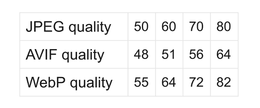
JPEG quality settings mapped to AVIF and WebP for visually similar results. One advantage is that the image’s file size can be 35% and 15% smaller, on average as compared to JPEG. More on this, and a tool to adjust these settings, here.
JPEG
Old reliable? Most images on the internet are JPEG (or PNG). JPEGs have comparable compression to WebP for photo images, worse for non-photo images (JPEG 2000 provides much better photo image compression with similar non-photo image compression rates). Also, JPEGs provide similar decoding (potentially faster encoding!) speeds to both WebP and AVIF.
WebP
Growing enterprise standard? WebP produced a 25-35% percent data savings compared to JPEG, and 80% compared to PNG for Facebook when they converted many image file types for Android users. While AVIF has better compression overall, it may not be able to compress non-photographic images as well as lossless WebP. Additionally, while WebP does not support progressive decoding, it does support incremental decoding.
AVIF
Up and comer? AVIF has been around for a while for video, but can also reduce the file size of images due to better compression. As a result, AVIF files download faster and consume lower bandwidth. This can potentially improve performance by reducing the time to load images. However, AVIF images take longer to encode and create, which could be a problem for sites that create images files dynamically. They’re also not supported on Edge, and only partially supported by Safari. Check out this tool for how WebP and AVIF stack up against JPEG for different qualities and dimensions.
JPEG XL
Moonshot? With significantly better compression and faster speeds, JPEG XL's only real limitation seems to be its recent release. Wider adoption may make this the clear favorite in the future, with even better progressive decoding than the original JPEG, and reduced generation loss in transcoding (images converted from original JPEG to other format options like WebP or AVIF). Read more on JXL compared to other formats here.
It seems that image format type was more or less at a standstill for 20 years, and only in recent years have other, much better options come along. As support for these options grows, we could see some crazy fast rendering for our currently image-heavy locations like Target's home page, PLP, PDP, and others. Check out this comprehensive overview of these and other formats, as well as their compression, speed, and other features.
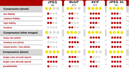
How image file types (codecs, formats, etc.) stack up against each other. See here for a more detailed comparison.
Progressive Rendering
Once you've chosen a file type for your image to download, one of the many choices to make is how to get your images to load faster. While that impacts an image's actual performance, you also get to decide how to get that image to the page in a visually appealing way for your users and increase perceived performance. Luckily, there are several techniques that use a relevant substitute image as a placeholder while the actual image downloads.
Note: Techniques covered are for progressive rendering, not baseline rendering which produces a sort of window shade effect as the image loads line by line. Read here for further distinction between the two. Also, this list is by no means exhaustive.
Contrast
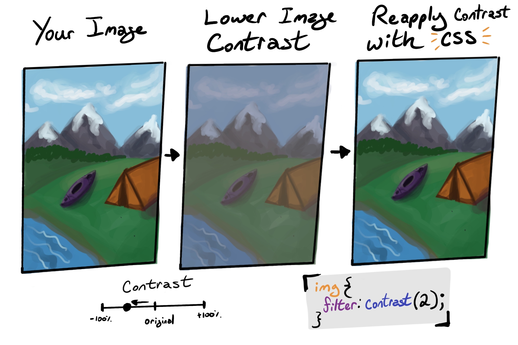
Your placeholder in this case is a lower contrast image. When the image fully loads, you ramp the contrast back up for a full color effect. But consider the downsides to this approach – a user's first impression on a page is important and seeing a duller contrast flash color and pop are expected, even if this facilitates image loading, may be jarring.
Gradient Image Placeholders (GIP)
Gradient placeholders rely on identifying the two most prominent colors in an image and plotting a linear or radial gradient between them. These gradients are displayed as placeholders until the image is loaded. I’m also not a fan of this, since while tools exist to make identifying gradients for dynamic images easier (check out GIP), it's completely based on color and gives little idea about the shapes composing the image.

When products are set against a white background, the GIP would be white blurred with whatever the other dominant color is, resulting in many similar images that are not much more helpful to a customer than blank space.
Blur in or Low Quality Image Placeholder (LQIP)
LQIPs rely on creating two versions of the same image. The LQIP is loaded first with the lower resolution image until replaced by the actual image after loading has finished. The trick is to reduce the quality and blur enough to reduce the added weight of an extra image, but not too much where the image becomes blurred beyond recognition and looks more like a gradient placeholder.

The blurry image is loaded almost instantly, clear enough where the intended item is identifiable, fading to the higher quality image when it loads.
Conclusion
As a former educator, I still believe the best way to learn a topic is to research, write, and apply it. While I learned a lot from this conference about image optimization and ways I could apply my learnings to my work at Target, I learned just as much researching the topics to write this post. Internal blogs have proven to be very effective on our team as a way to share a deeper dive on topics that our colleagues may find interesting, and we also continue to supplement these with other tools like Slack for quicker information-sharing. Whichever method of documentation you use, I encourage you to have some sort of knowledge-sharing forum where the content is written both by and for fellow engineers so we can collectively improve the sites and apps we work on together.
RELATED POSTS
Product Engineering @ Target: Engaging With Our ‘Why'
By Nancy King, May 2, 2022
Our product engineering organization builds a large proportion of the applications that our millions of guests and 350,000+ team members use, from the mobile app and website to our point-of-sale software, to the HQ systems supporting our operations. These are the technologies that help bring Target’s purpose to life and grow our business online and across nearly 2,000 stores nationwide. The key to success is really knowing and supporting our users across the country.
