
This blog post is a follow-up to a presentation given at Fastly's Altitude NYC conference on April 17, 2018.
Target's API Gateway has been around for many years now, and in 2015, we added a new element to the front of our stack - a CDN, Fastly. Initially, our configuration was really simple, with no caching at all - APIs would come to opt in to caching through the Surrogate-Control header - and a simple router to send requests to different origins depending on where the service was hosted.
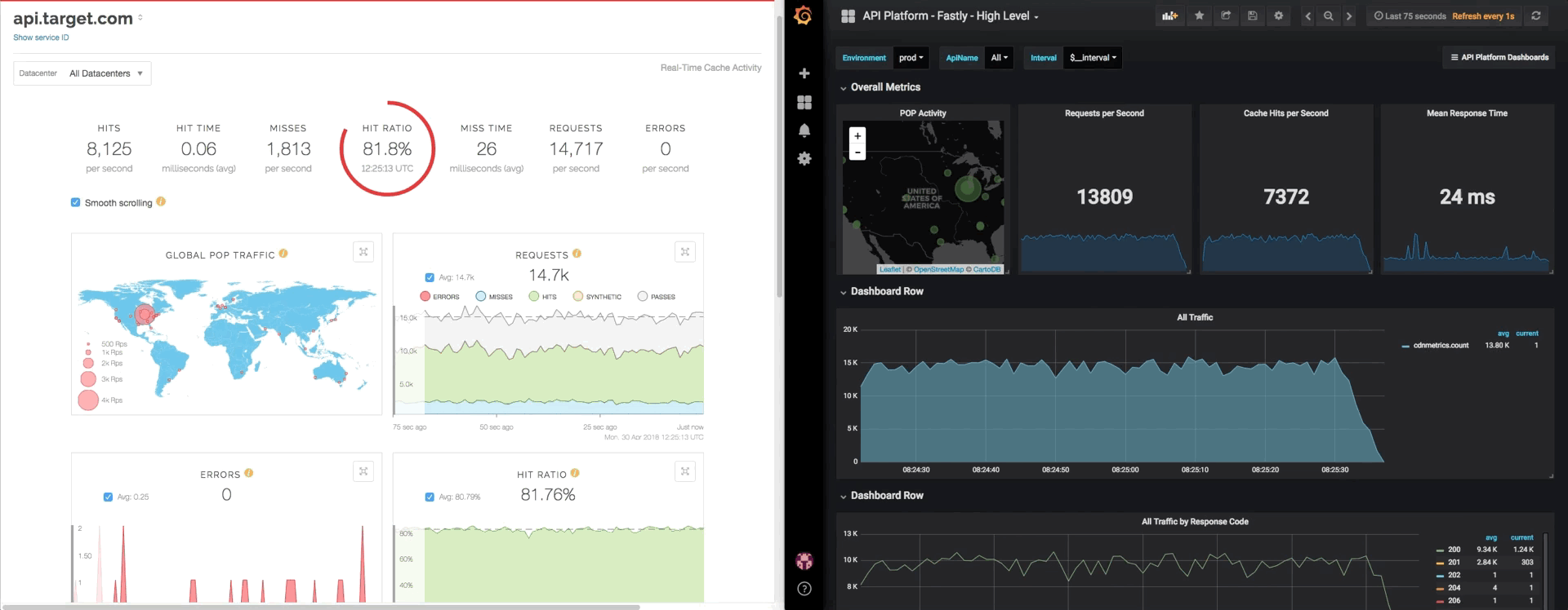
Most mornings after the rollout were spent looking at the Fastly-provided dashboard, getting a feel for our volumes in a way we hadn't before, and watching to make sure errors didn't spike up. Most people read the paper or watch the news with their coffee in the mornings. I look at dashboards.
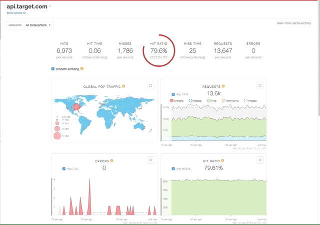
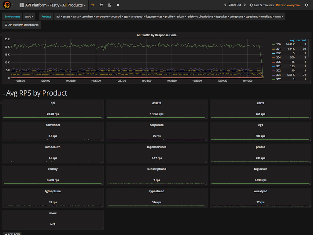
As our footprint with Fastly has grown, so has the number of dashboards I have to check, and the size of my coffee. I still need detailed information per service, I just have many more services to care about now. My default first tab changed to something higher level.
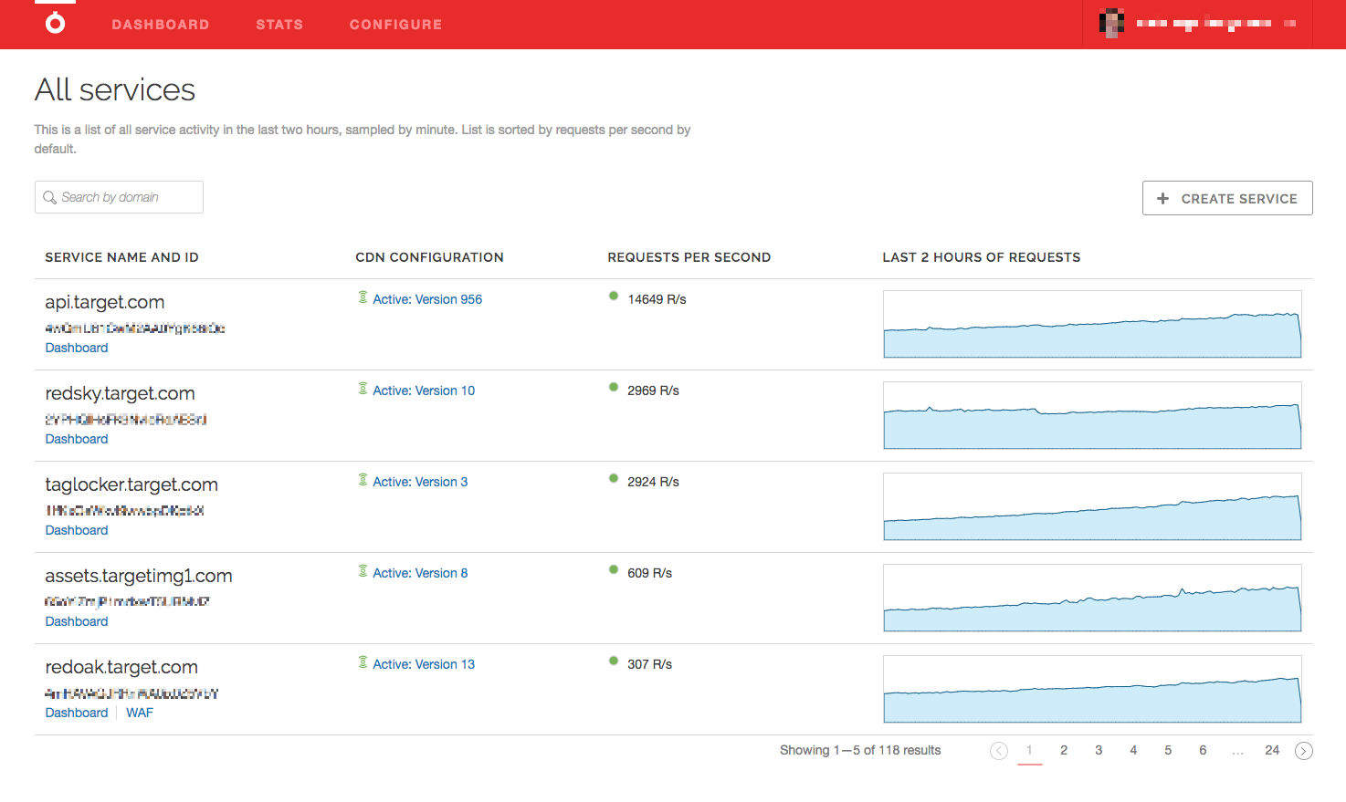
After hopping between these two charts countless times, I realized what was missing. I wanted a single view that gave me all that information in one place. I wanted everything, and it needed to be as close to real time as Fastly's dashboards are.
Breadth and Depth
The information I was looking for was a combination of two things - breadth and depth.
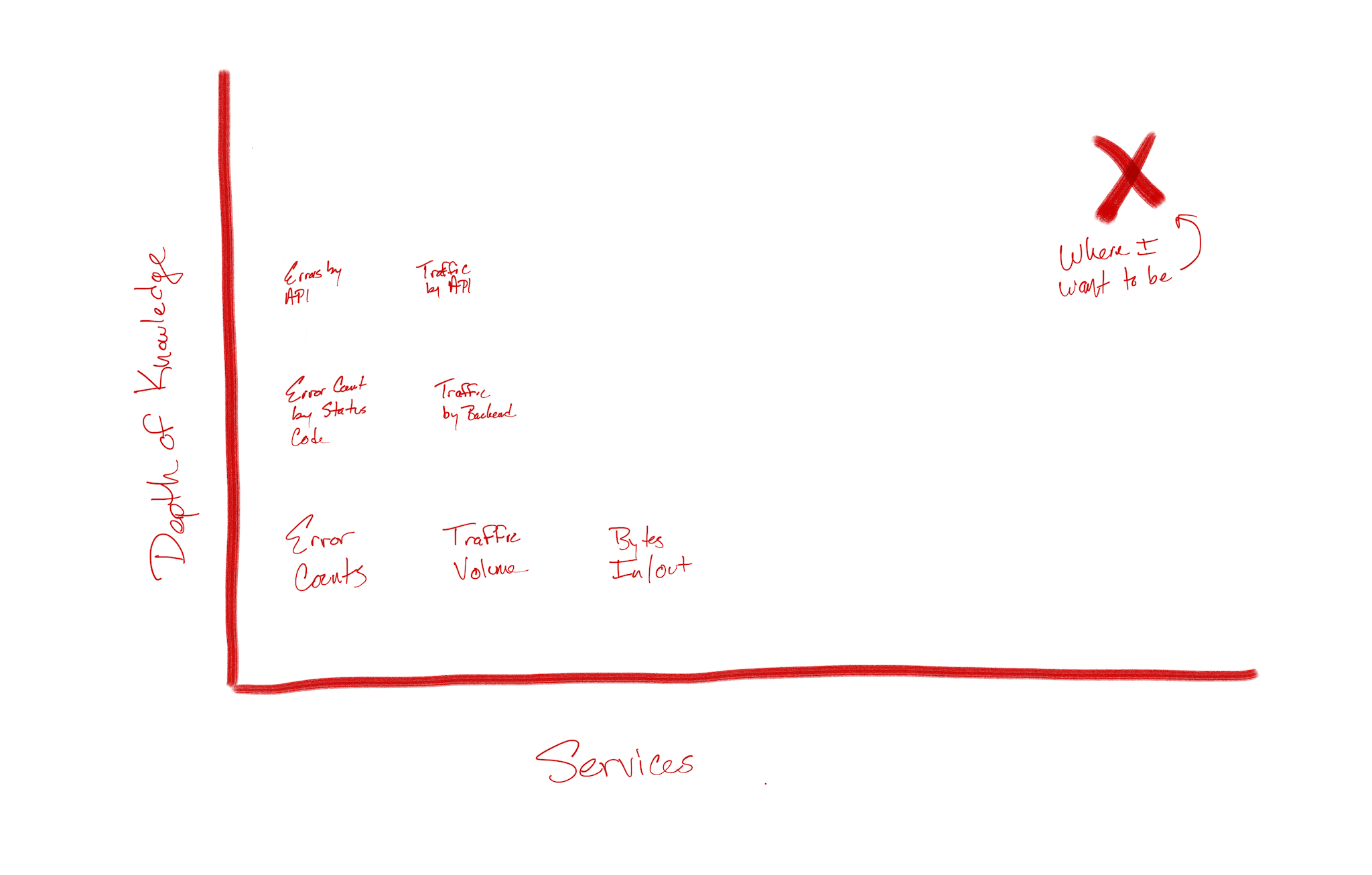
I had depth in the form of the service-level dashboard - pieces of information like traffic volume, bytes in and out, error count were all available to me, but only at a high level. In the case of the API service, going deeper would mean knowing which APIs were contributing to the error count, or which backend was taking the most traffic, or which POP was showing the most unauthorized calls to a given API. For the other services we've onboarded, they have their own dimensions of information that are useful in different ways. Of course, I wanted those, too.
Breadth is simple by comparison. For me, this is a single place with the absolute most important, common information easily available, and providing a jumping-off point for more detail when needed.
That's not too much to ask, is it? I was worried it may be, but turns out, it wasn't.

Enter Measurement
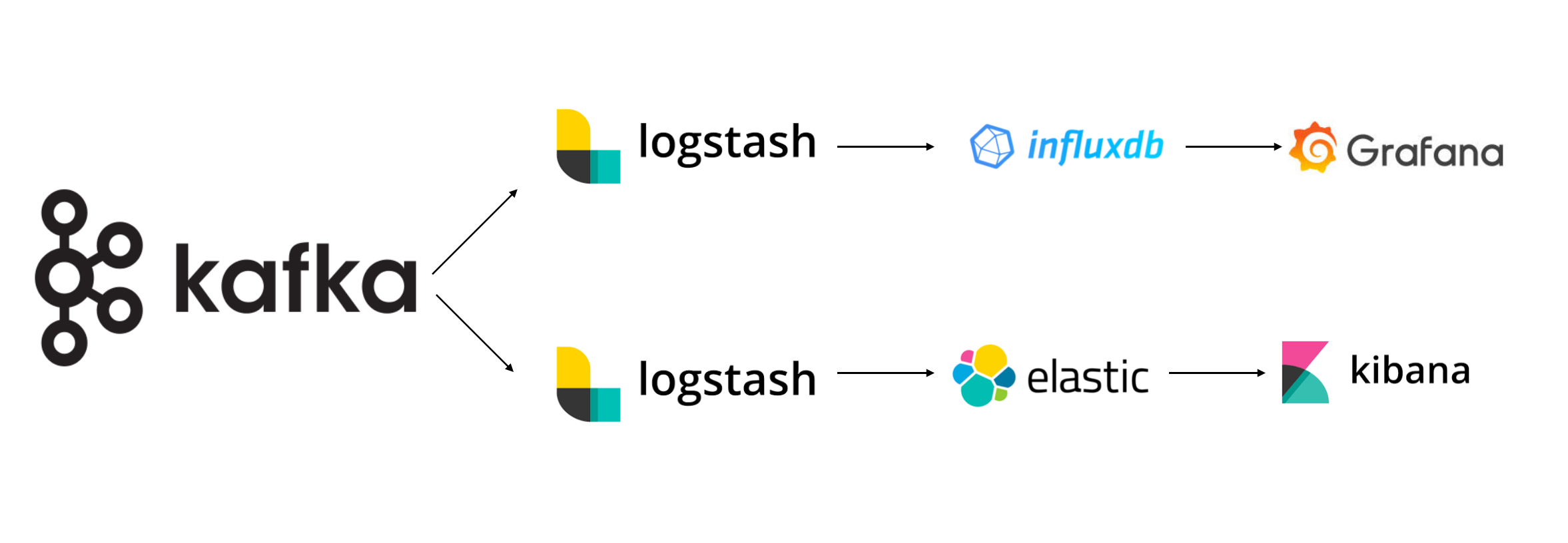
There are many, many ways to capture and store the data we'd need to build these dashboards, some open source and free, others for pay. At Target, we've standardized our measurement offerings around an collection of open source tools in a single stack. Like our API Gateway, the goal of the Measurement team is to provide an easy-to-use and available system for collecting observability data that teams can interface with easily, allowing development teams to focus on their applications.
Fastly offers many means for log transmission, but being old school, we use vanilla syslog. We have several dedicated Logstash instances in our cloud provider that are set up with a TCP input and Kafka output, and one set for logs and metrics, each. This bridges the gap between Fastly and our Measurement pipeline pretty efficiently, especially if we focus on formatting the message in VCL before sending it. More on that, below.
Logs and Metrics
At the risk of gross oversimplification, consider the following:
Logs tell you what went wrong.
Metrics tell you what's happening right now.
Subscribing to this model gives you some great flexibility.
Logs are expensive to keep (they take up a lot of disk space, for example), so why not just keep error logs? When things go right, you don't need as much detail as to what went right; knowing it worked is usually good enough. However, when things break, you really do want to know where they broke to go find it and fix it.
Metrics, on the other hand, are smaller in volume and easier to store. Usually they're pretty rigorously formatted (more on that later), and sent to data stores purpose-built to hold them. The relative simplicity of a metric combined with the available data types makes them easy to query, aggregate and visualize. Creating sums over time, or calculating P95s or P99s, are easy when storing a high number of small integers.
How We Use Log Streaming
Fastly offers a large number of logging integrations, but we use syslog and specifically formatted strings for delivery. Notably, we've also removed Fastly's default logging macro from our VCL (heads up - this will generate a warning during compilation), and call log directly from vcl_log.
On the Target side, we use Logstash listening on TCP and sending the line received directly off to Kafka - no transformations or groks or anything. To do so, we add an input and output to Logstash's config, similar to the following:
{{- $logtype := env "CDN_LOG_TYPE" -}} input { tcp { host => "0.0.0.0" codec => {{ if eq $logtype "metrics" }} plain {{ else }} json {{ end }} port => 514 type => "cdn-{{ $logtype }}" tags => ["cdn","{{ $logtype }}"] }} output { if "cdn" in [tags] { kafka { bootstrap_servers => "kafka-broker.internal:9092" acks => "0" {{ if eq $logtype "metrics" }} topic_id => "cdn-metrics" codec => plain { format => "%{message}" } {{ else }} topic_id => "cdn-logs" {%raw%}{{ end }} } }}You probably noticed the variables in there - this is a Consul template file. These topics are simplified down for the sake of example, but in reality, we read in environment variables to derive the appropriate topic, and use that to determine whether Logstash is running to capture logs or metrics. We run two sets of receivers - scaled independently - to capture either logs or metrics sent from Fastly, one per type. These receivers live in our cloud provider and are whitelisted to Fastly's IP ranges only. There's also a load balancer over each cluster for good measure.
Logs
Logs come in to our ELK stack as structured JSON messages, formatted at Fastly in VCL. Creating proper JSON in VCL can be a daunting task, but believe me, it's worth it, especially with the help of multiline strings, such as this:
sub vcl_log { if (resp.status >= 400) { log {"syslog $SERVICE_ID DEST-APP :: "} {"{"} {" "product":"api", "} {" "x-api-id":""} req.http.X-API-ID {"", "} {" "api_name":""} req.http.API-Name {"", "} {" "request_url":""} req.url {"", "} {" "req_body_read":"} req.bytes_read {", "} {" "resp_body_written":"} resp.bytes_written {", "} {" "request_backend":""} req.http.Request-Backend {"", "} {" "actual_backend_name":""} req.http.Actual-Backend-Name {"", "} {" "actual_backend_ip":""} req.http.Actual-Backend-IP {"", "} {" "client_ip":""} client.ip {"", "} {" "event_timestamp":""} strftime({"%Y-%m-%dT%H:%M:%SZ"}, now) {"", "} {" "method":""} req.request {"", "} {" "resp_status":""} resp.status {"", "} {" "resp_message":""} resp.response {"", "} {" "cache_status":""} resp.http.X-Cache {"", "} {" "elapsed_time":"} time.elapsed.msec {", "} {" "fastly_info_state":""} fastly_info.state {"", "} {" "fastly_pop":""} server.datacenter {"", "} {" "fastly_region":""} server.region {"", "} {" "fastly_server":""} server.identity {"", "} {" "scheme_type":""} req.http.SchemeType {"""} {"}"}; } }A few things to call out in this entry:
- We only log if the status code is 400 or above. This goes back to only keeping the errors.
- This is a structured JSON message, encoded in VCL. These two things don't always get along well, but by taking advantage of the fact that VCL doesn't care about line breaks, we can use them to construct what will ultimately be a single line of JSON in many lines of VCL. Neato. A word of warning - the quotes and braces get confusing, so the best bet is to leave your last line alone, and only add above it. Feel free to take mine above as a starting point - it's valid, I promise.
- There are a handful of variables in there that we parse out of the URL in VCL using regular expressions. These variables are useful to us in many other ways, and logging is just one of them. For example, req.http.API-Name represents which API is going through our API service, and req.http.Request-Backend is the name of the data center we intended to send the request to, where req.http.Actual-Backend-Name is the name of the individual data center it did go to. Since we use directors, these values could differ. Likewise, if Fastly has trouble talking to our backends, the actual backend will be null.
Metrics
Metrics come in similarly, except we format the message as Influx Line Protocol. By sending the message this way at Fastly, we can send it straight through to our Influx servers, ready for visualization in Grafana.
Without going in to a full tutorial on ILP, know that a line of ILP is made up of four components:
- Measurement - The grouping of data you're collecting, akin to a database table.
- Tag - An attribute of the measurement in key/value format. Tags are always strings.
- Field - The actual measurement value in the form of an int, float, string or bool.
- Timestamp - When the measurement occurred. This can be in different forms, but nanosecond-prevision is preferred.
We use Fastly's time.end.usec plus three zeroes for the timestamp as it's when the event actually happened. The tags comprise keys similar to those in our log entry, minus non-actionable information.
For fields, we only collect elapsed time and time to first byte in milliseconds. This helps us create calculations and aggregations of time (which we can slice and dice by tags), or count the number of fields to get quick summaries of volumes (sliced and diced similarly).
Our log entry for a metric looks like this:
log {"syslog $SERVICE-ID DEST-METRICS :: "} {"cdnmetrics,"} {"product=api,"} {"environment=prod,"} {"cache_status="} resp.http.X-Cache {","} {"resp_status="} resp.status {","} {"api_name="} req.http.API-Name {","} {"request_backend="} req.http.Request-Backend {","} {"actual_backend="} req.http.Actual-Backend-Name {","} {"info_state="} fastly_info.state {","} {"pop="} server.datacenter {","} {"region="} server.region {" "} {"elapsed_time="} time.elapsed.msec {","} {"time_to_first_byte="} time.to_first_byte {" "} time.end.usec {"000"};A few things to note here as well:
- The two empty spaces are critical to ILP - it's how it distinguishes tags from fields and fields from the timestamp. Since multiline VCL like this comes across as a single line, having those spaces on their own makes it easy to read.
- Similarly, any key/value pair that may have a space needs quotes, and they need to be double quotes. Don't forget that VCL doesn#39;t require escaping them, but it will get confusing to read.
- There are many variables in this entry that are parsed similarly to the ones in our log entry. Pull useful data about your configuration into variables for consumption here. Adding them as request headers is a good way to make sure they don't get returned to the consumer, but they will end up on your origin.
When formatted correctly, it will look like this:
cdnmetrics,product=api,environment=prod,cache_status=HIT,resp_status=200,api_name=locations-v2,request_backend=director_Target,actual_backend=$SERVICEID—TargetBackend1,info_state=HIT,pop=MD,region=US-Central elapsed_time=0,time_to_first_byte=0.000 1522670899146991000For readability, in multiline format - note that this is invalid ILP:
cdnmetrics,product=api,environment=prod,cache_status=HIT,resp_status=200,api_name=locations-v2,request_backend=director_Target,actual_backend=$SERVICEID—TargetBackend1,info_state=HIT,pop=MDW,region=US-Central elapsed_time=0,time_to_first_byte=0.000 1522670899146991000Let's See Some Examples!
What does all that work to format metrics as ILP and send them to Influx get you? Tons!
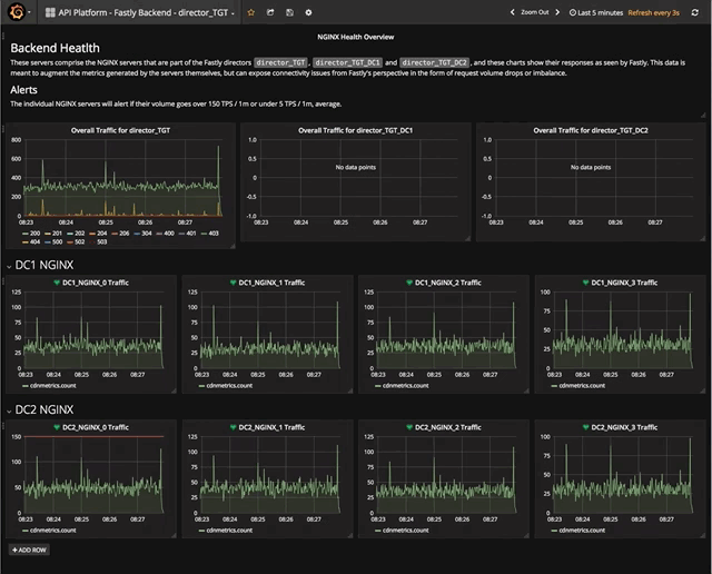
Now, instead of seeing Fastly's home page of volume by service, I have a dashboard of every product and its volume, as well as an overall line graph of volume by response status - I love response codes because they very quickly highlight changes in behavior at my origins.
From this view, I can get an in-depth view of any service with contextually relevant data. In the example of our API service, I can see volumes by API, or backend, or both, and in just about the same speed as Fastly's dashboard.
Going deeper, I can break out the error chart into something that will quickly tell me the appropriate team to engage in times of errors.
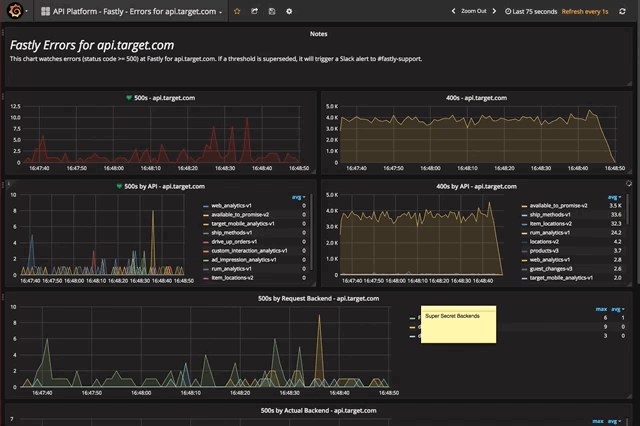
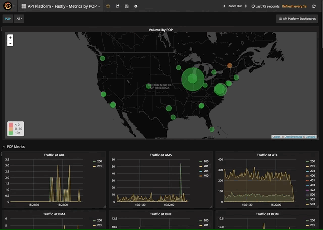
And from there, the limits are only my tags - I can see errors by API and backend, or make a POP chart of just my errors, or get visibility to the volume by individual backend server. Nearly any way you'd want to view your data is possible, and is available quickly and responsively.
But Wait, There's More! Alerts
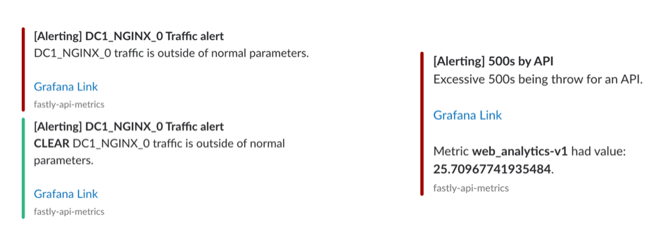
As I mentioned at the start, my mornings used to start with viewing these dashboards over coffee. Over time as we grew reliant on metrics, we started to also take advantage of alerting, something offered in Grafana. It may have been hard to see, but some of our dashboards have either a little green solid heart or a little red, broken one. These indicate the health of the metric based on parameters of our choosing.
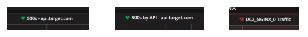
Grafana offers many outputs for these alerts, and in our case, that is eventually a monitoring channel in Slack. Nearly as quickly as Grafana realized there's a problem, we know about it, too.
Creating alerts had an unintended but very welcomed side affect as well - something I've recently learned is called intuitive engineering. From days of watching various metrics, I'd come to learn what "normal" feels like with regards to our volume. This made it easy for me to know when something was out of sorts and needed deeper investigation. This was also incredibly hard to teach others, since it was limited by time. However, with Grafana, I could take my knowledge of normal and describe it in a query.
Now, not only didn't I have to think about the dashboards, but no one else did, either - we'd know when something goes wrong, because the system would tell us. My morning coffee never tasted so calm.
Moral of the Story
Onboarding our API and other services to Fastly turned out to be the easy part. Knowing exactly what was going on, when it was going on, was something that took time. By taking advantage of Fastly's real time log streaming, we were able to collect and develop knowledge on what was happening at the CDN, and integrating that into deeper knowledge at other parts in our stack.
You Know Your Data, so Build Your Logs Around It.
Fastly's dashboards provide a great starting point for visualizing your data, but only we could add in actual knowledge about the requests themselves based on our business. In terms of the API service, this means breakdowns by API name, or by data center. For other services, it could be file type - images versus JavaScript versus CSS, for example. There is some data that all requests have, like response code or size in bytes or elapsed time, but the real gems are the pieces you extract in VCL and send through your log stream.
Ease in to Metrics, then Use Them as Much as Possible
Logging is as old as Hello, World! itself, and we've learned to trust them over time. But, more and more, their usefulness is being limited - if not completely replaced - by metrics. Properly granular metrics can tell us as much as logs can, and more quickly, pointing me in the direction of my problems when they arise. On top of that, we can alert based on them, and only look when we needed. That said, trust is earned over time, and only logging errors was not something we did from day one. Once we learned to trust metrics, we could start to reduce logging.
Tag Smartly, but Generously
Applying tags to our metrics help slice them in nearly any way imaginable, but too many tags come at a cost - cardinality. We needed to know which pieces were critical across all services, as well as how to augment individual services with useful data to create our dashboards. We've settled on a good set for now, and there's always (some) room to grow.
Learn the Feel of Your Data
When I started watching dashboards, I though the idea that they had a "normal" feel was an odd thing to say, so I didn't. But humans love patterns, and there's definitely a pattern to our data. By knowing general patterns about our data, it's easy to know what looks right, and set up alerts to let us know when that pattern isn't met. Good alerts take to you the dashboards directly, where investigations can begin.
What's Next?
Everything! Getting the data is just the start. I found that when I'd make one dashboard, the idea for two more would pop up. With more than 150 APIs in production and now nearly a dozen production services, there are so many interesting ways to look at the data, it's hard to build all the right dashboards.
So far, my priority has been building ones to share the institutional knowledge I've been carrying since joining this team. That means building out the alerting for the API service to better position my team for supporting all those APIs. As I partner more with the other teams onboarding services to Fastly, new trends emerge for useful dashboards, so those will be coming shortly.
Of course, the final step, and maybe most important, is marketing. Having all this data is great for my team, but once it's in a store suitable for Grafana, full stack dashboards can be built out. We've started some automation to that effect based around Swagger specs, but helping individual teams realize the power of this data and learning what they find useful is a never-ending task in the best way.
Nowadays, my morning still starts with coffee, but instead of going straight to the Fastly dashboard, I make a quick pass at the alerting Slack channel to make sure things are addressed, then can get down to work sooner. As someone who likes to have as much information available as quickly as possible, I find great comfort in the ability to see everything, all at once, in a dashboard, and get alerted for when it is time to do so.